
 Zurich Insurance · Case Study
How I led the design of Zurich’s first app for its largest LatAm market
Designing and shipping Zurich One Seguros, Zurich's first mobile app in Brazil, as the sole UX/UI designer working directly with the company's policy and marketing teams.
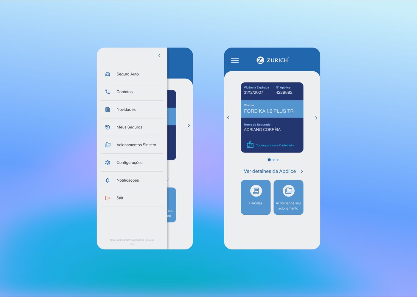
Problem
No mobile channel in its biggest LatAm market
Before the app
- Check policiesWeb portal only
- View invoicesWeb portal only
- Open a claimPhone call only
- Contact supportPhone or web
Result
Zurich’s first mobile channel in Brazil
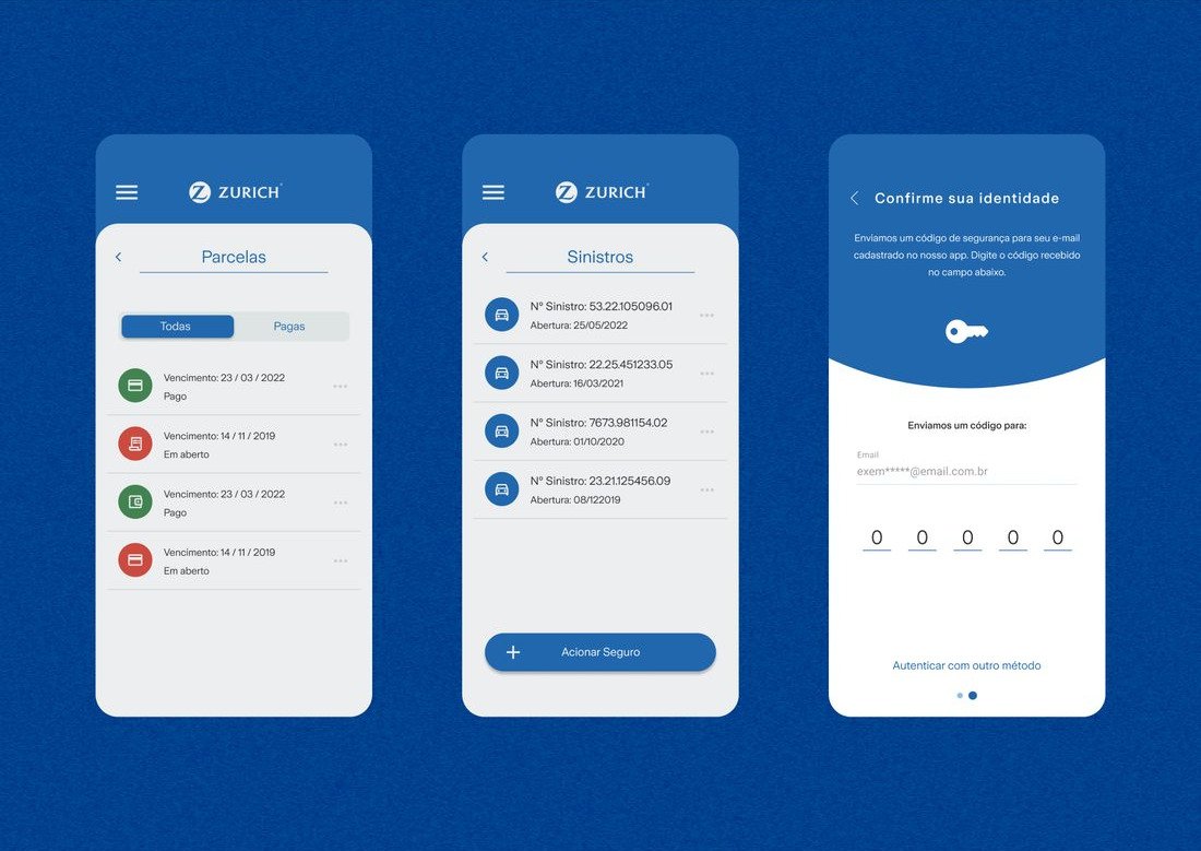
Delivered within a heavily regulated insurer, a tight MVP scope and Zurich’s design system, the app gave Zurich its first mobile channel in its largest LatAm market, closing a gap that had been flagged as a strategic risk.
Process
Which features did the MVP prioritize?
Zurich needed a mobile channel fast, but a first app couldn’t do everything. Every feature had to earn its place in the scope.
What made the cut
Ship first · In the MVP
- Policy detailsCheck the policies they own, anytime.
- Payment informationSee payment details for each policy.
- Contact channelsAll of Zurich’s relevant support channels in one place.
- Zurich newsThe news feed from Zurich’s web portal, for customers who want to stay up to date.
Plan next · After launch
- Opening a claimRequired a brand-new claims channel inside Zurich, built just for the app.
- NotificationsAlerts when there’s something important about their policy.
- Offline modeKey policy information available without a connection.
Trade-off
- What I chose
- A focused first release. We prioritized the journeys with the highest traffic on Zurich’s web portal. Bringing them to mobile meant customers could manage their policy from anywhere.
- What I sacrificed
- Self-service claims, for now. We knew opening a claim mattered to users, but it needed a new claims channel inside Zurich, which wasn’t feasible in time or budget. It became a post-launch priority, along with offline mode.
- The risk
- Opening a claim was still in the app, but it opened the phone’s dialer with Zurich’s claims line. Customers still had to call, so the app had to earn their trust with everyday tasks first.
4 rounds of testing
- Round 1WireframesNavigation and flows → led to the policy card
- Round 2Hi-fi prototypeCore flows and clarity of legal copy
- Round 3AuditPerformance and full accessibility check
- Round 4Benchmark2 fewer taps, 70% less time
Designing the experience
The policy card: a familiar way in
- Context
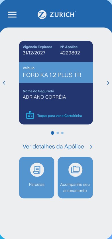
- Customers were used to checking a physical card or ID for their policy number and coverage.
- Evidence
- In Round 1 wireframes, users took longer than expected to find and switch policies.
- Decision
- Card first on the home screen: no menu to dig through.
- Laid out like a printed card: all the information where customers expect it.
- Swipe between policies: one card per policy, with tap to open the full card.
- Why
- A familiar object needs no learning. By Round 4, users found their policy details in 70% less time.
Payments: status at a glance
- Context
- Customers came to payments with one question: what’s paid and what’s still open?
- Evidence
- 55% of web portal users visited the payments section in the same login session.
- Decision
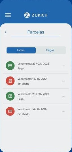
- Quick filter: switch to paid payments only, a habit from the web portal.
- Color + text status: green for paid, red for open, with the status also written out.
- Tap for details: the vehicle, amount and payment method.
- Why
- Status reads at a glance and past payments are one tap away: 2 fewer taps to reach payments in Round 4.
Accessible by default
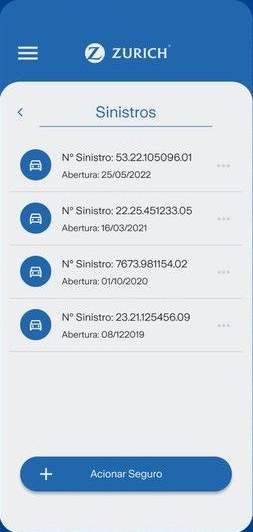
- Context
- A regulated insurer with a broad customer base and dense legal copy.
- Evidence
- Round 2 checked that legal and insurance terms were understandable. Round 3 ran the full accessibility check.
- Decision
- Readable text and contrast: AA contrast against Zurich’s blues.
- Spoken labels: every icon and button works with screen readers and text-to-speech.
- Large touch targets: main actions span the screen width.
- Why
- Every customer should be able to manage their policy, whatever their ability: the app meets WCAG 2.1 AA.
Learnings
This project was my clearest lesson in multidisciplinary collaboration: seeing firsthand how a design decision moves through legal, marketing, and policy teams before it becomes a shippable product. It was a project built by many hands, and it sharpened how I present and defend design decisions to stakeholders outside of design.
This was one of my first projects owning the entire design process, and it taught me a lot. With what I know today, I’d take more initiative to bring new ideas to the table and pitch them with more confidence and stronger reasoning. With more time, I’d also explore bolder UI concepts for the app.